
Accessible experience and design system for M&S.
Millions of people in the UK and internationally shop at M&S. It's a heritage British brand loved by several generations. We worked on designing an accessible cross-platform experience and pattern library for the core marksandspencer.com website.

Key achievements.
Checkout journey redesign.
First phase of redesign - checkout journey, forecast to bring over £20 million additional revenue to the business a year.
Accessible design system.
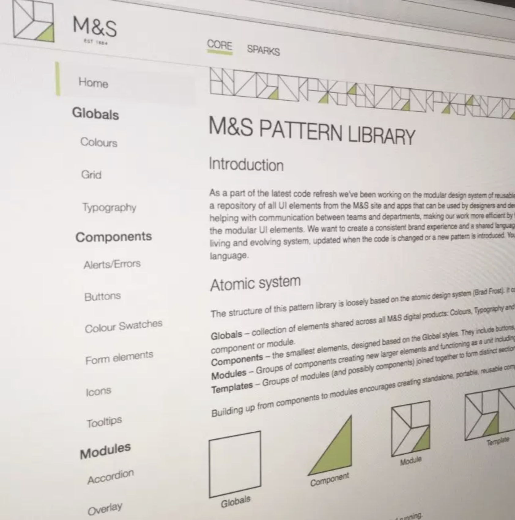
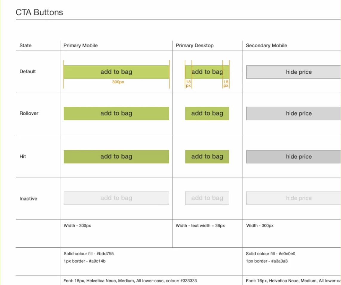
A global accessible design system was designed for a consistent and efficient workflow. It was reflected in a pattern library that also works as a communication tool between product teams.
International M&S design strategy.
This design strategy expanded globally including the international team and franchised M&S websites by other teams at M&S.

Context.
M&S launched their own web site in Feb 2014, moving away from an Amazon platform to their own custom platform. Since then, many new features were developed which created a complex, disjointed experience. The visual treatment and experience of the site were also split for different platforms.
The design brief for this project was to create a consistent, user-centered, cross-platform experience and to review the features live on the site.
Furthermore, our team’s objectives were to design and develop for accessibility, performance, speed and SEO.
Irina Rusakova:
“As a product design lead, I was the point of contact for all stakeholders and team members. I collaborated with a cross-functional team to deliver accessible designs that created better customer experiences.”
Objectives.
The design brief for this project was to create an accessible, user-centred, cross-platform experience and design system. We also added a stretch goal of creating a system of reusable components reflected in a pattern library that helps designers and engineers in various product teams across the business stay consistent and increase productivity by avoiding duplication.
We worked collaboratively with product teams across the business to prioritise the features that were built for different platforms.
One of the key goals for us was to make this experience accessible. Close collaboration with engineering teams allowed us to create an accessible design throughout and a system of accessible components that could be reused by the product teams.
We discovered that making designs and interactions accessible also helped to increase the load speed for pages.
Throughout the process we engaged with product teams to understand the current process and create a pattern library for engineers and designers.


User Experience.
At the start of the project, each platform had a slightly different experience and inconsistent features. The first phase of the project was to review these features and their performance to align the experiences. We reviewed customer feedback and insights collated by the in-house user research team. We also collaborated with the analytics team to look at the data and the key flows in the journey and compare these journeys on different platforms to identify the ones that performed better. As a part of this phase, we also conducted interviews and workshops with stakeholders, product owners and designers related to this part of the product. Together we’ve reviewed and prioritised the features and came up with a plan on how to optimise and clarify the cross-platform journey.
We approached information architecture and experience design as mobile-first, which helped to remove unnecessary content and create a clear hierarchy on each page.
All this information helped to create a clear plan for the first phase of the redesign. We prioritised the features and came up with an optimal flow that is beneficial for every platform.
Accessibility.
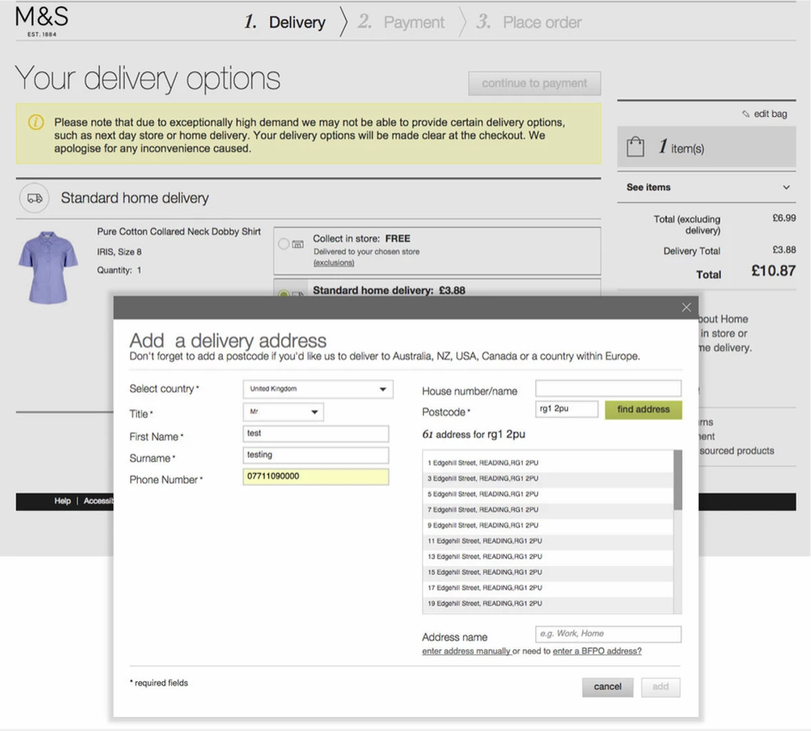
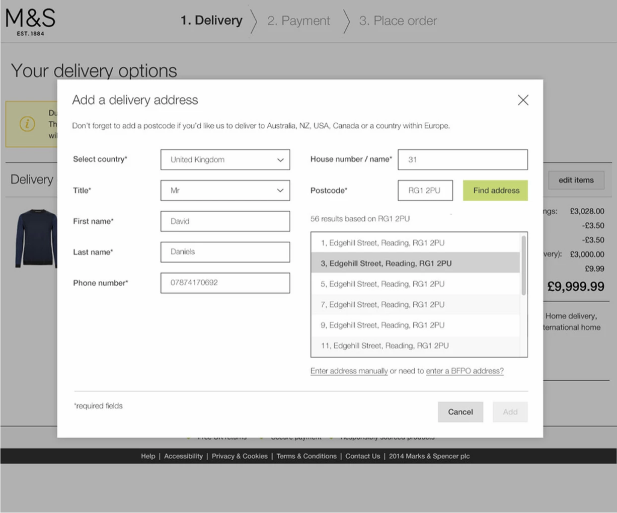
Accessibility was one of the key focuses of the project, so we reviewed the existing experience and interactions to identify gaps and mismatches in the current design. We reviewed accessibility at every stage of the project including experience design of the journeys, interaction design and visual design. Some of the areas of improvement that we identified, included creating a smooth and clear transition between the pages of the checkout flow by looking at them holistically.
Reducing the number of overlay interactions.
Adding Alt text to the images and the elements that are not recognised by screen readers.
Improving keyboard interaction and tab states of the journeys.
Interface design.
Similar to user experience, we had three different visual treatments of our digital products. The mobile site was using the card's effect, whereas the desktop had a dated interface with gradient buttons, drop shadows and small interactive areas. Furthermore, the tablet was a touchscreen optimised desktop design. So again the challenge was aligning and creating an optimal experience for all platforms and devices.
We were going through a gradual redesign transition. The design decision was to stay close to the current colours and linear layout, but to refresh the interface, making it modern, clean and touch-friendly.
Modular design.
A cross-platform and responsive approach confirmed the idea of creating a modular design system. We also wanted to help product designers across the business to create consistent experiences and maintain consistency in the future. We wanted to create a tool that would help to communicate the latest design changes and avoid code and design duplications. The solution was to create a pattern library that everyone could access.
Final steps.
We added new interactions to improve user pain points, simplify the journey by removing features that no longer served user needs and create a clear visual hierarchy. Then the designs were user-tested to gather feedback and validate the solutions. After the build and close collaboration with development teams, each page was first A/B tested. This allowed us to monitor the code merge and to compare the customer engagement between the old and new pages. Very soon we saw significant results.
After forming the UX/UI strategy, we shared it with the rest of the UX team. They could then work in autonomy creating new responsive features with their product teams. We also engaged and shared the strategy with the International team, who were going through a similar phase of the responsive redesign.

Results.
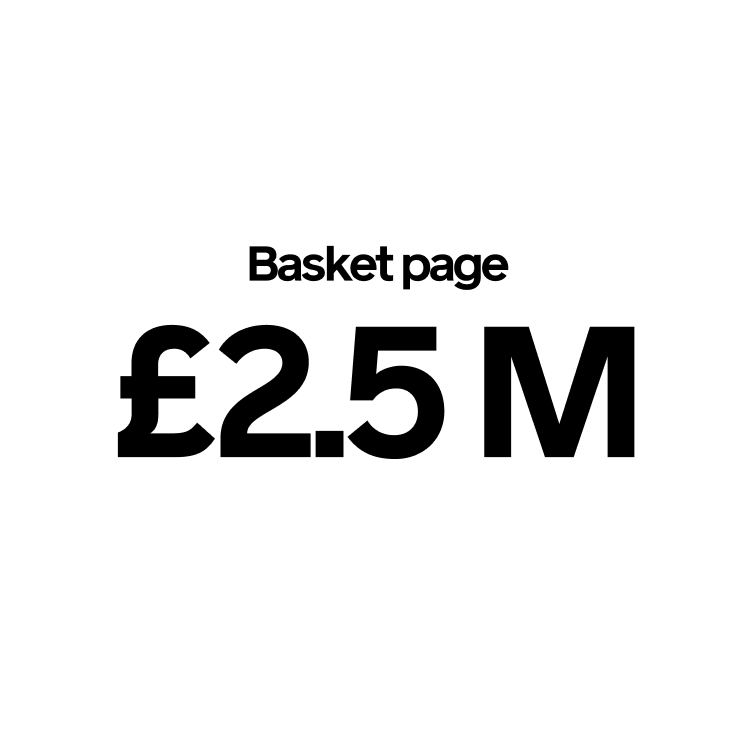
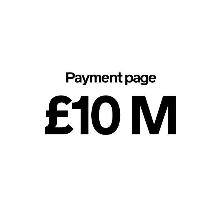
A combination of these four parts of the project created a new accessible and user-centred experience. We prioritised the features and enhanced the experience with brand new interactions and improvements to the journeys. We created an inclusive and accessible experience for M&S customers. As a result, the percentage of customers completing the checkout journey dramatically increased. The Express checkout page forecast to bring an extra £9 million, Payment page £2.5 million and Basket page over £10 million for the business a year. Collaboration with designers across various product teams and also the International team resulted in creating a consistent and responsive experience in other products of the .com site and internationally.
Would you like to do the same for your company? Get in touch!
Prefer the regular email?
Let us know about yourself and how we might be of help to you.
Email us on: